The Fortune-Telling Machine That Turned Every User Into an Oracle
Turned a boutique predictive analytics consultancy into high-dollar ROI insights, surfaced at a glance.
Challenge
NGP VAN, a leading CRM platform serving major nonprofits like Planned Parenthood and the National Audubon Society, had acquired DonorTrends—a sophisticated predictive analytics company that helped nonprofits through white-glove consultation. The work was sophisticated, but the business model wasn't scalable, and when COVID hit, fundraisers needed accessible tools that could surface high-ROI opportunities instantly.
Solution
We transformed consultation into self-service: a Fundraising Optimization Guide (FOG) with interactive calculators and actionable recommendations, plus predictive scores embedded throughout the platform to surface insights wherever users were already working.
What we impacted
Transformed the business
- Our self-service preview drove 10% demo conversion
- Our self-serve solution also reduced time-to-value from 2-3 weeks to instant access
Drove Engagement & Satisfaction
- Fundraising dashboard widget drove 60% of initial FOG discovery
- CSAT improved from 70% to 82% when comparing integrated FOG to DonorTrends Classic
Strengthened Market position
- NGP VAN became the only unified CRM with integrated predictive analytics for nonprofits
- Fundraisers reported increased confidence in strategic recommendations
- Fundraisers used insights to secure key stakeholder buy-in
What I Learned
Acquisition integration is design work
- Success came from treating the DonorTrends team as design partners, not subject matter experts we were extracting knowledge from. The design workshop I facilitated created shared ownership of a solution neither team could build alone.
empowerment Is just as important as efficiency
- Fundraisers needed confidence to decide without consultant validation. Time savings mattered, but the real win was giving them data to advocate with leadership.
Crisis made adaptability essential
- COVID reshaped what fundraisers needed from their tools. Organizations that pivoted from consultation-dependent to self-sufficient survived. Our self-service approach became essential, not just convenient.
How We Tackled It
Acquisition integrations are part detective work, part diplomacy. We dove deep, brought everyone together, and figured out how to preserve the magic while making it accessible.
Became a sponge
We dove deep with the DonorTrends team to understand their predictive models. The analytics were incredibly valuable, but trapped in an unscalable delivery model.
Sales reps were building demos from scratch with no standard materials, scrambling to explain complex predictive models without proper tools.
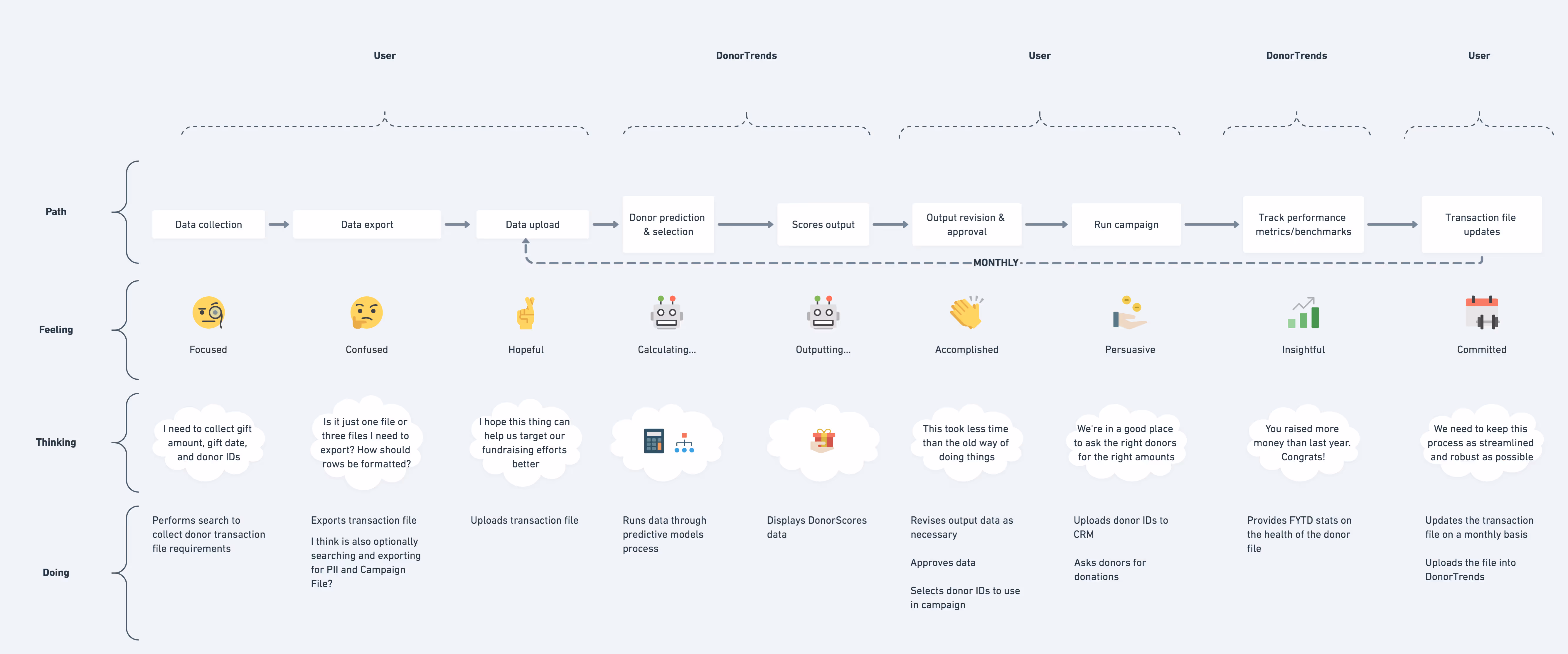
Users expected instant access after signing contracts but waited up to a week, then sat through 3-hour training sessions and monthly user groups just to understand what scores meant.
Users were then stuck manually maintaining a monthly ritual: collect data from their CRM, export transaction files, upload to DonorTrends Classic, wait for processing, get scores back, then figure out what to actually do with them.
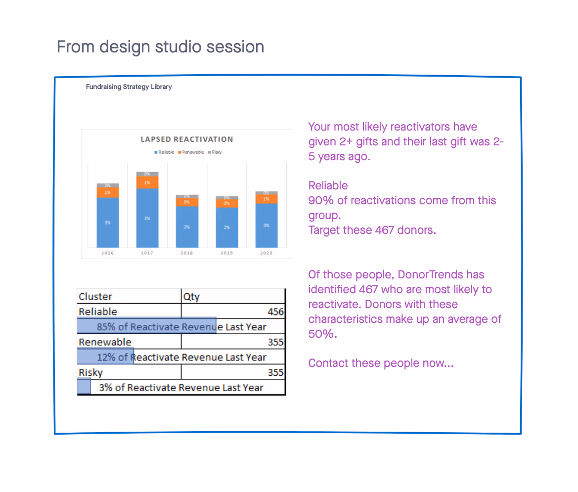
Got everyone designing together
After gaining context and doing research, I facilitated a workshop with my PM and the DonorTrends team to present findings and review. We also sketched solutions together and aligned on serving both sophisticated users and resource-constrained teams.
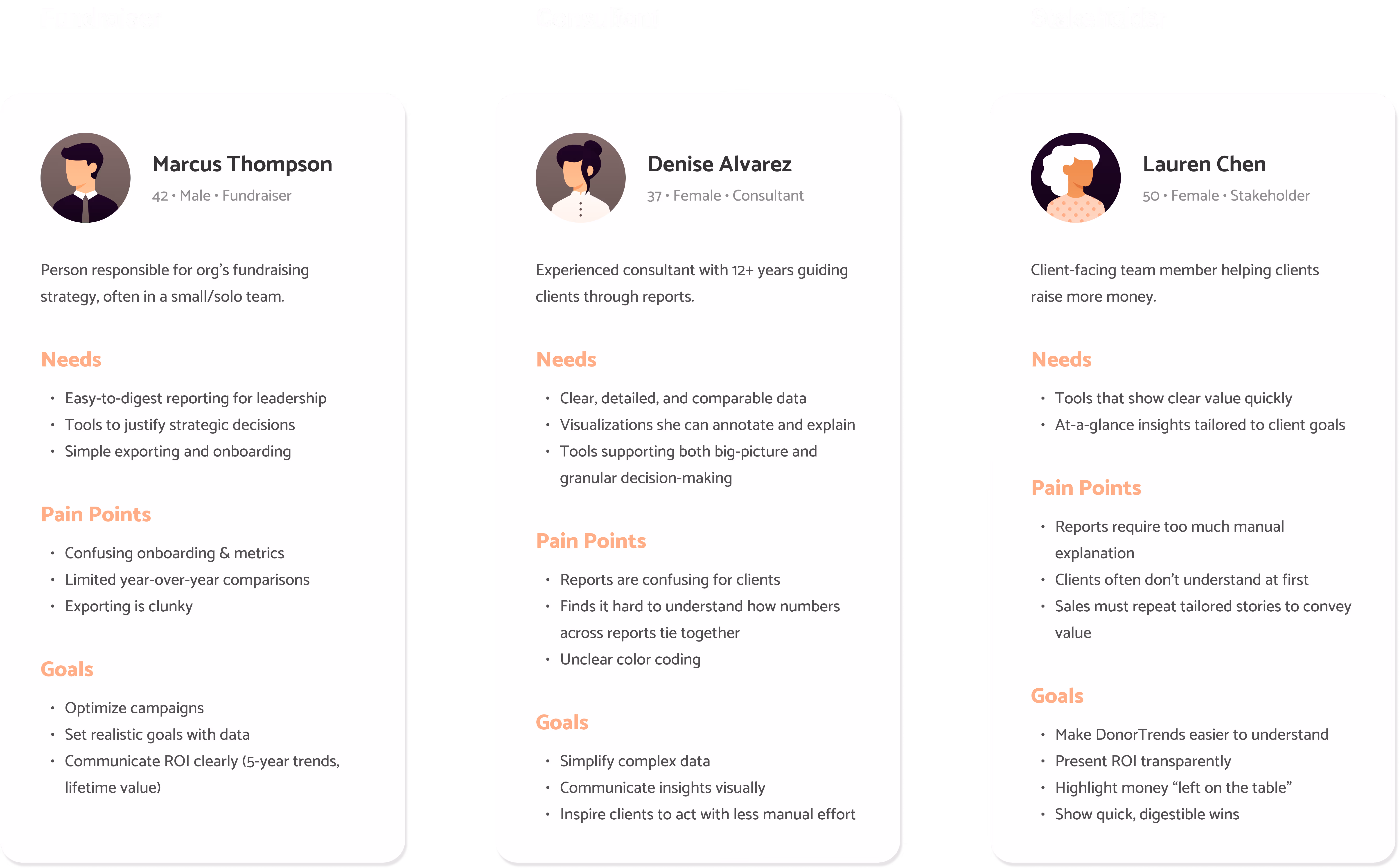
I presented personas that were based on the discovery calls we had with clients, consultants, and internal stakeholders.
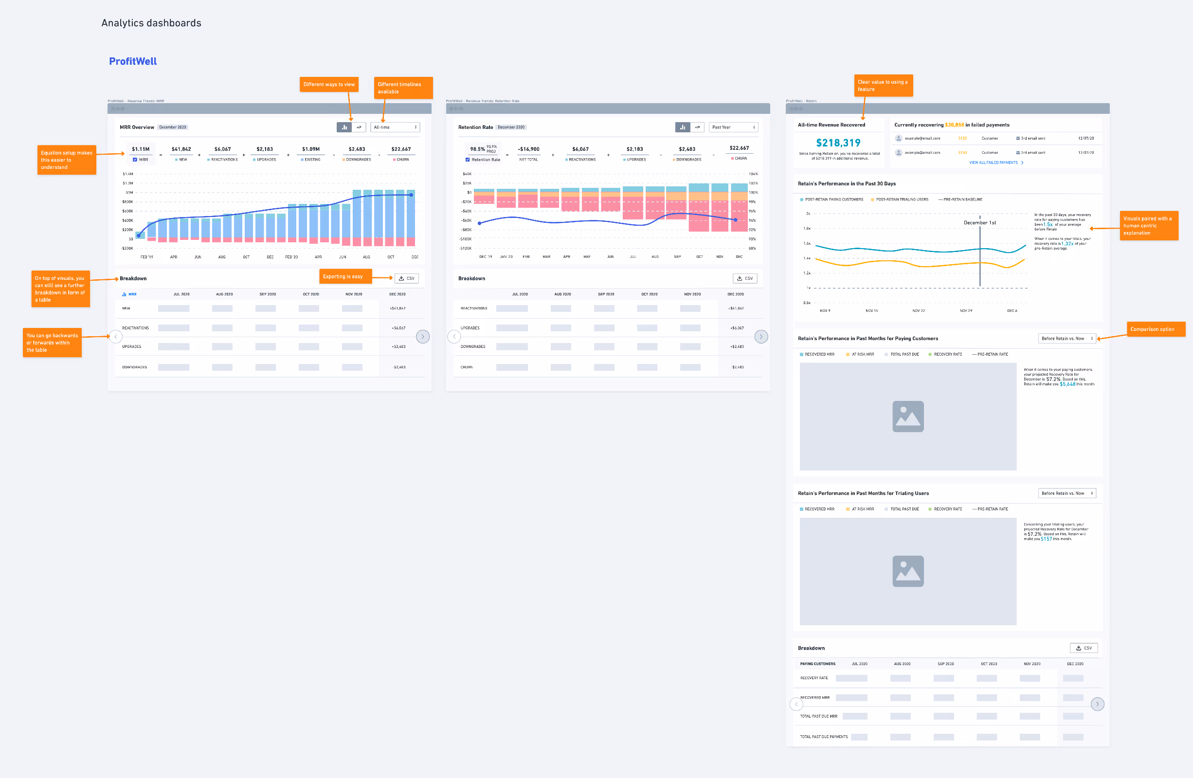
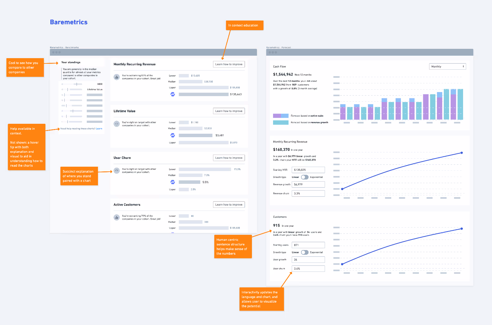
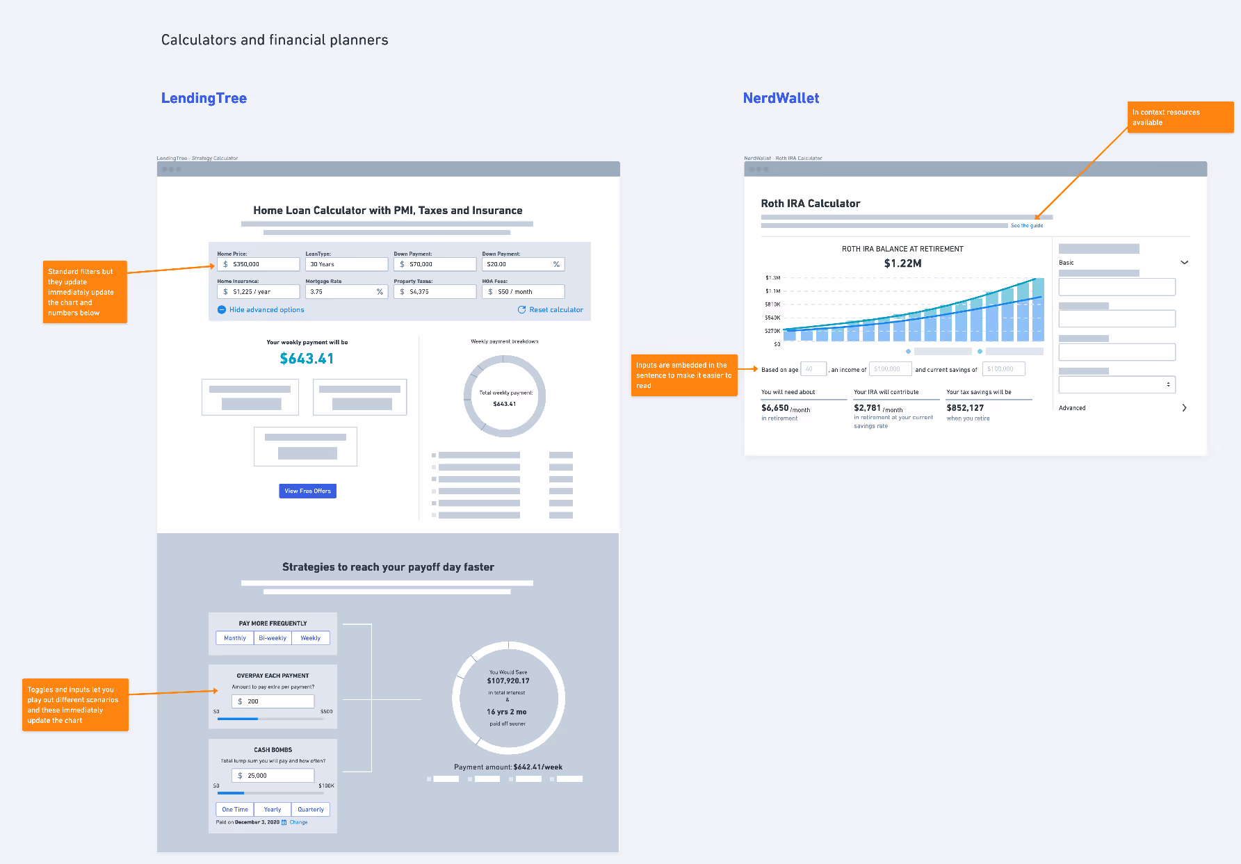
I then presented stripped down wireframes of comparative analytics dashboards and financial calculators that made complex information seem easier to understand.
Once we'd aligned on the user insights and research, we introduced How Might We statements to frame our solution brainstorming.
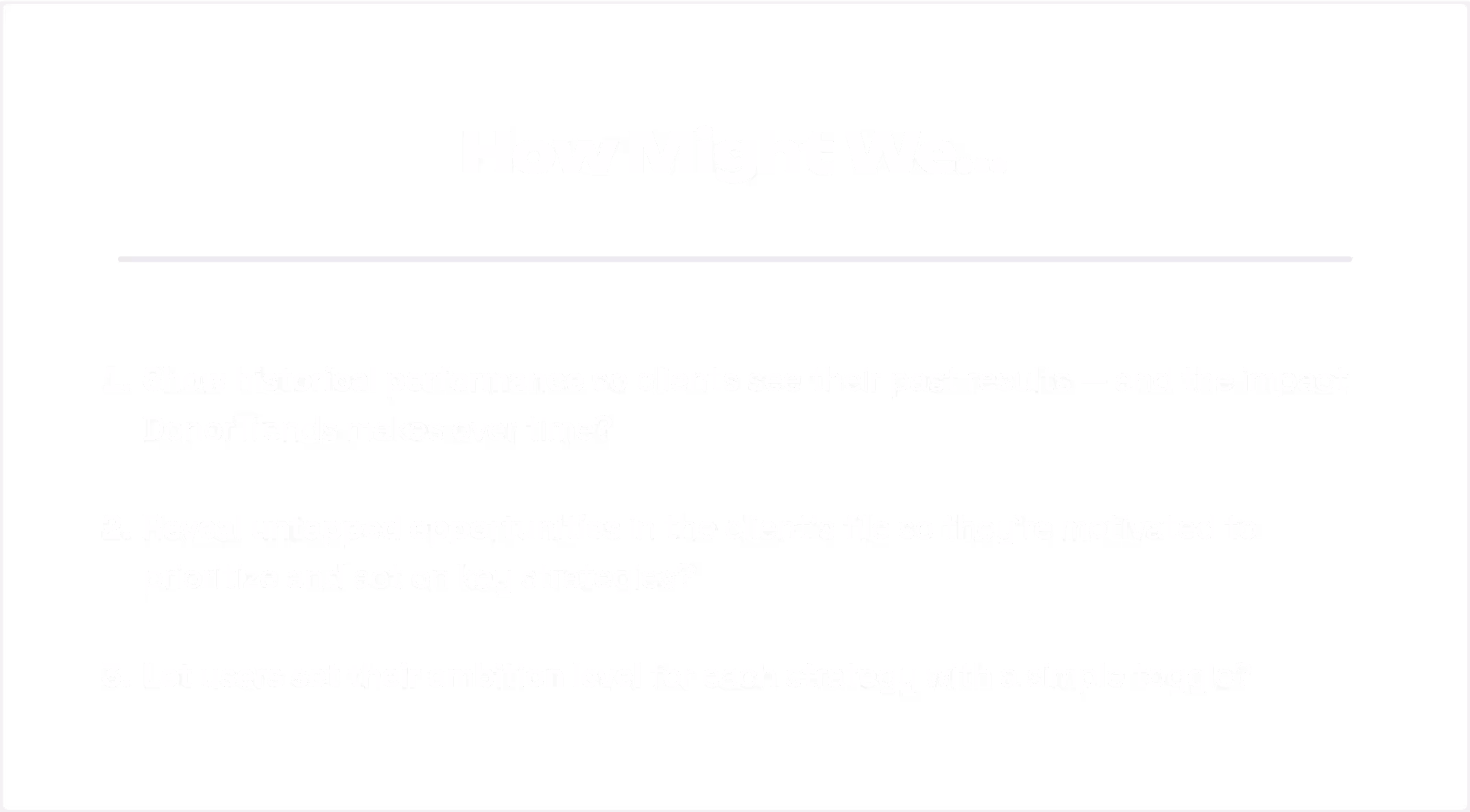
I provided a content structure template and asked the DonorTrends team to fill in the specifics. They knew best how to explain their insights to fundraisers.
Building on their input, I created more detailed wireframes. When the copy became too dense, we refined the final workshop version to be more scannable.
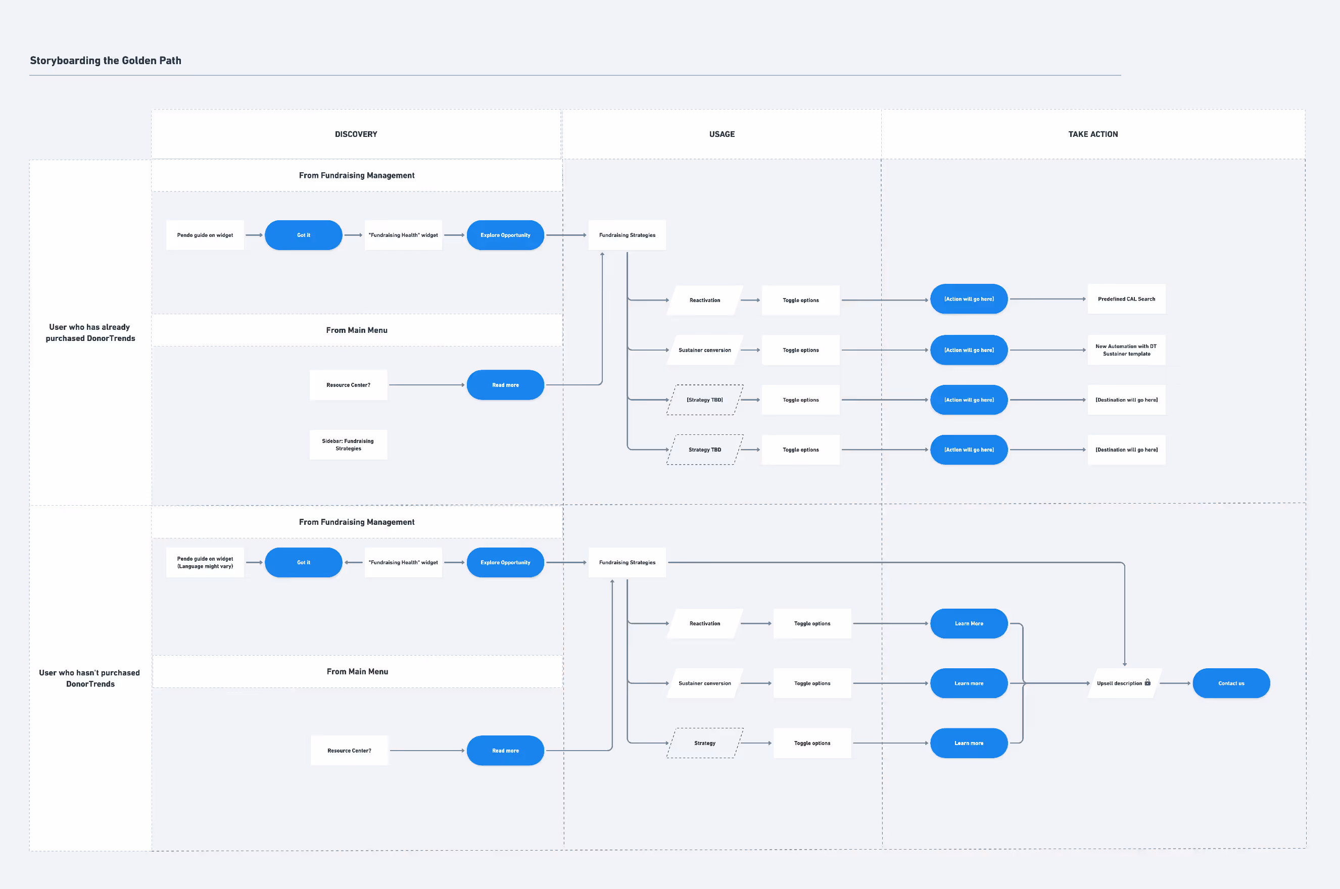
We also defined our 'Golden Path' user journeys for two customer segments: those who had already purchased DonorTrends and those who hadn't, helping both groups maximize value from powerful predictive modeling.
Started building the machine
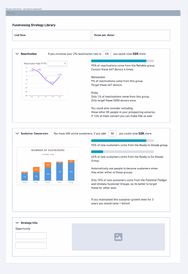
I stuck with wireframes to stay nimble and move faster with lots of incoming information like placeholder copy and chart specs that were still being figured out.

Iteration 1
My first wireframes explored a modal where users would pick their goal (like "reactivate lapsed donors") and only see relevant charts for that choice. It felt focused but quickly proved too restrictive since switching goals meant starting the whole process over.
Iteration 2
I tried a single page with left-side tabs for switching strategies and checkboxes to select donor clusters. The tab navigation didn't match existing patterns, the layout felt jumbled, and stakeholders kept questioning the checkbox UX (What happens when unchecked? Should the primary button ever look disabled?).
Iteration 3
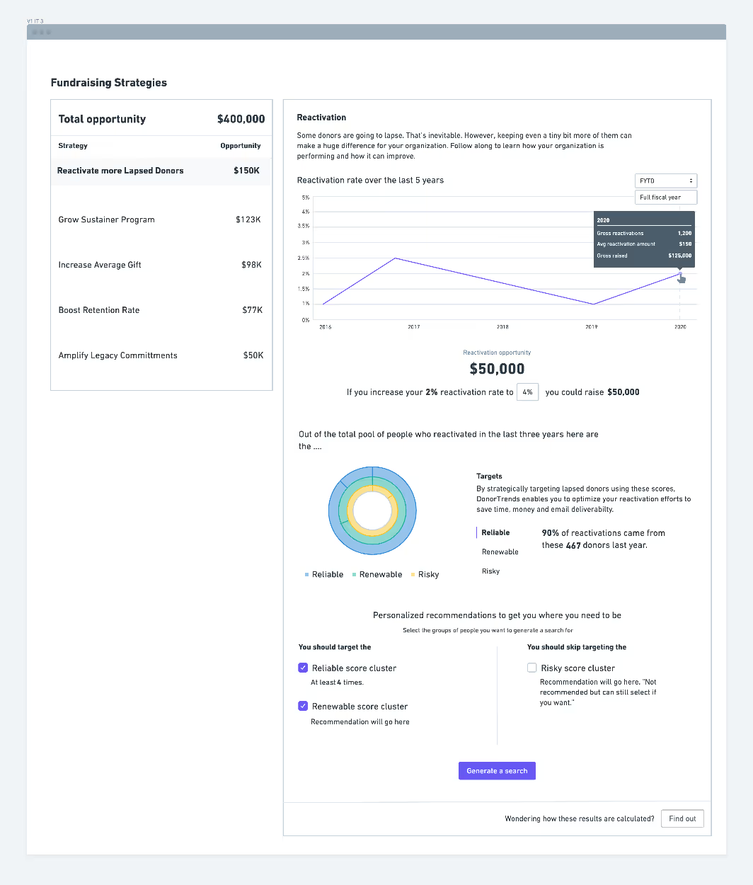
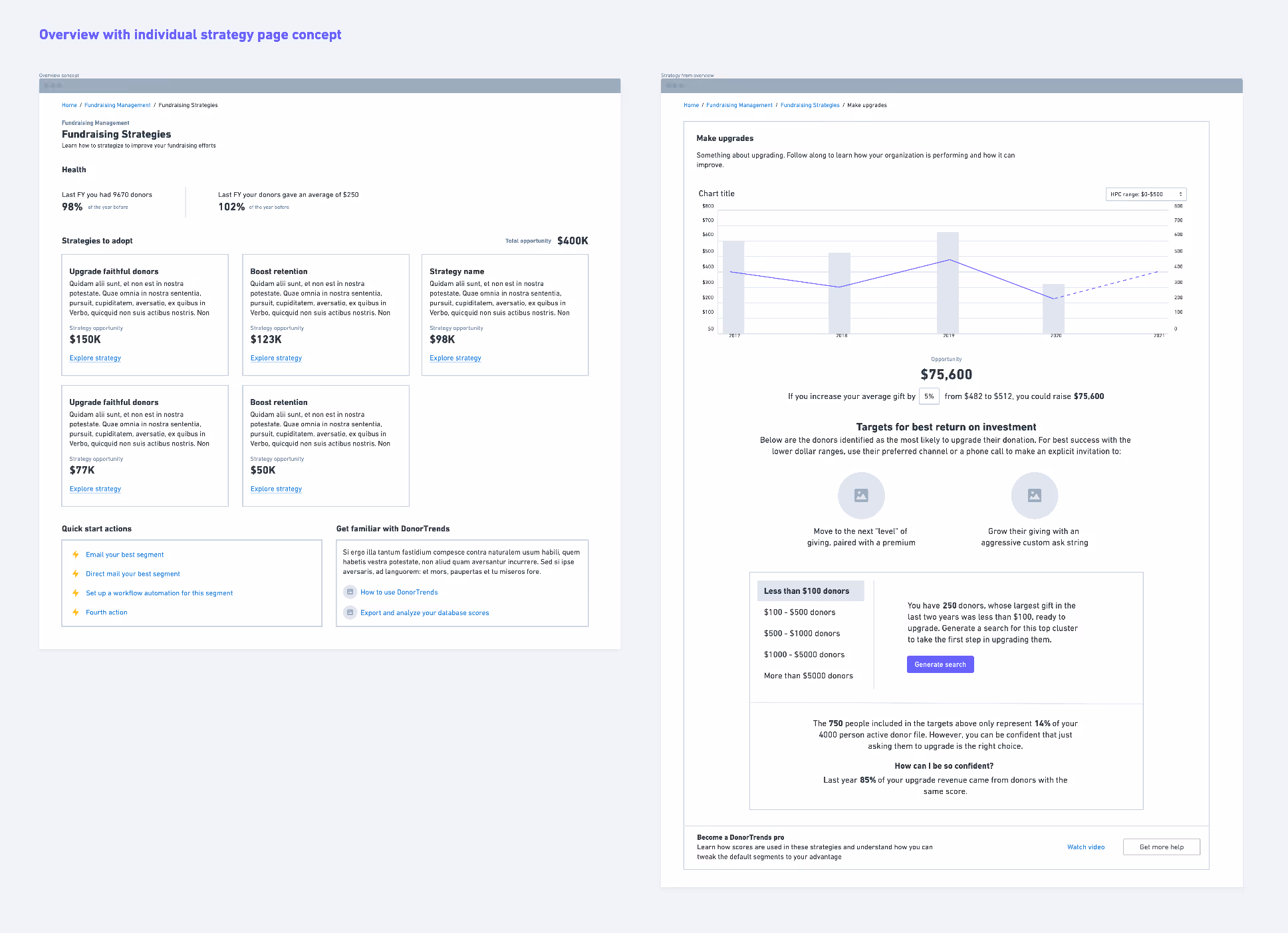
I tried a library approach with strategy cards that clicked through to individual detail pages, plus quick actions and help resources. It felt way too complex and created a huge burden since users couldn't compare strategies without constant page-hopping.
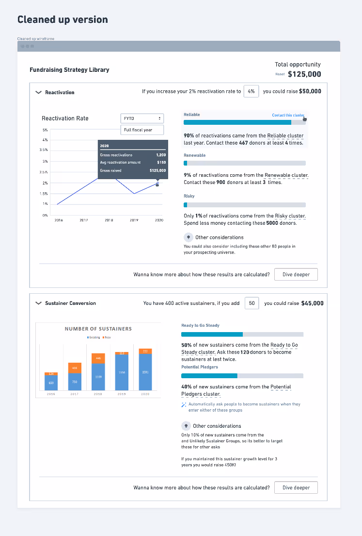
Validated with users
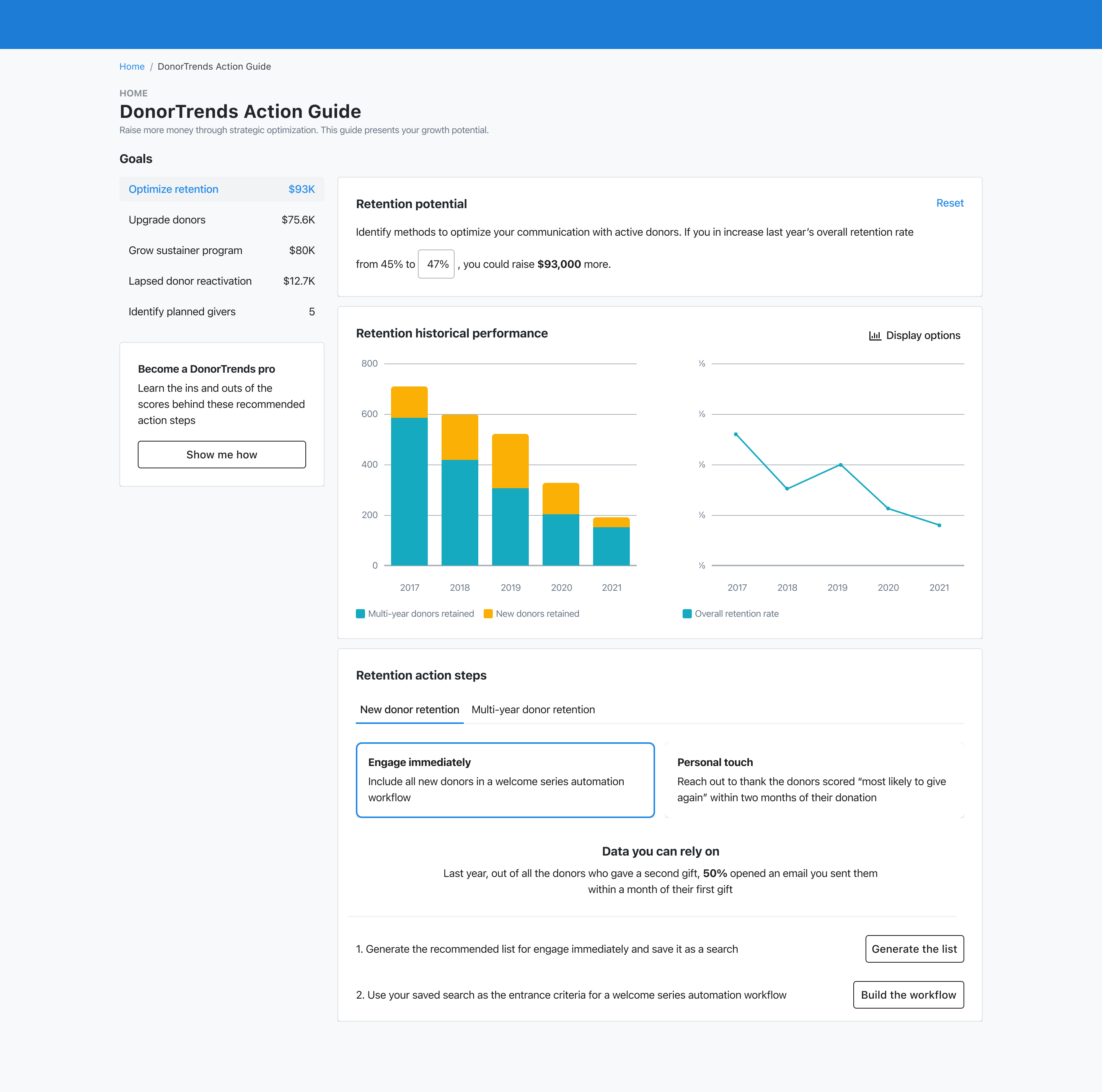
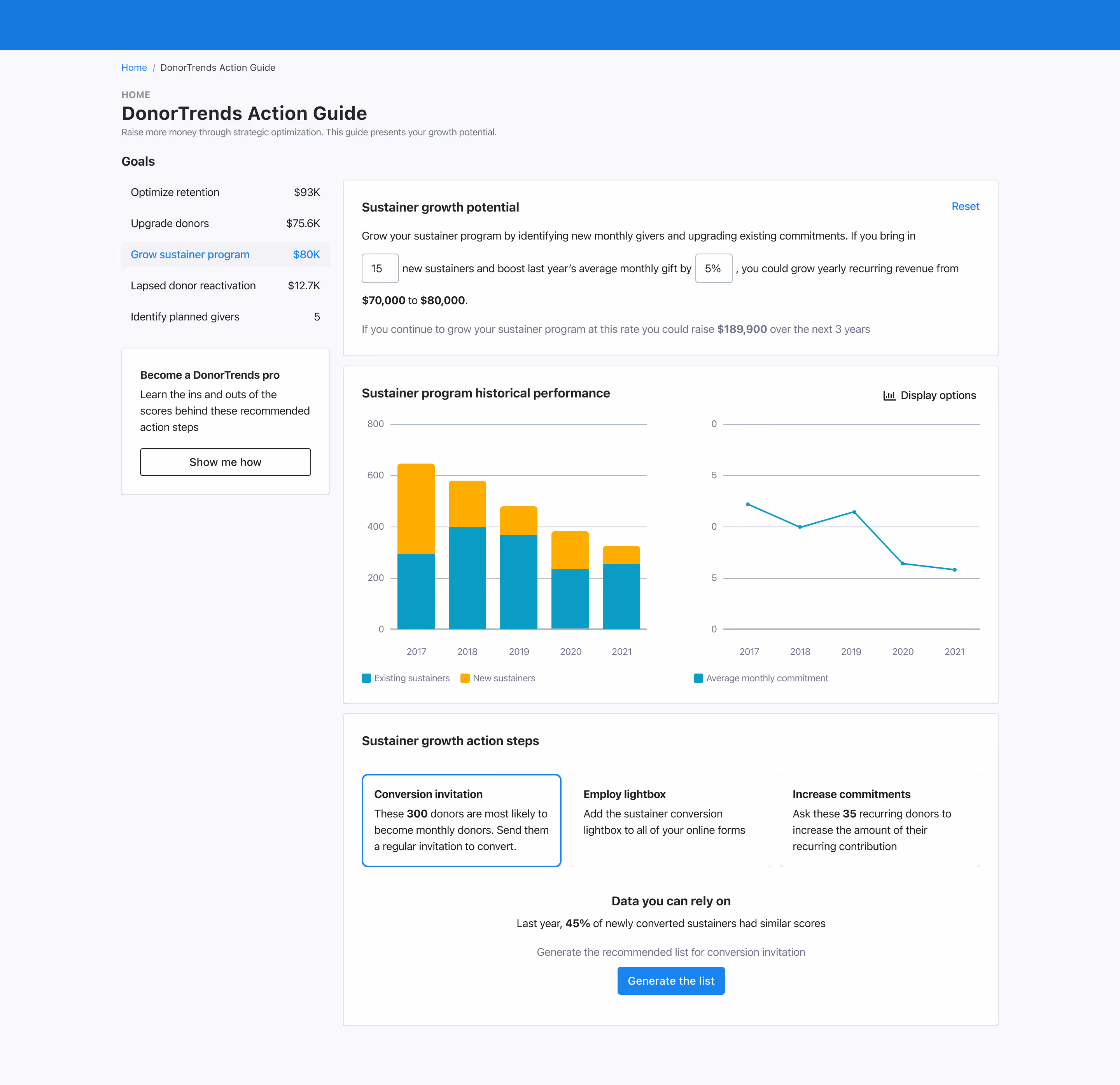
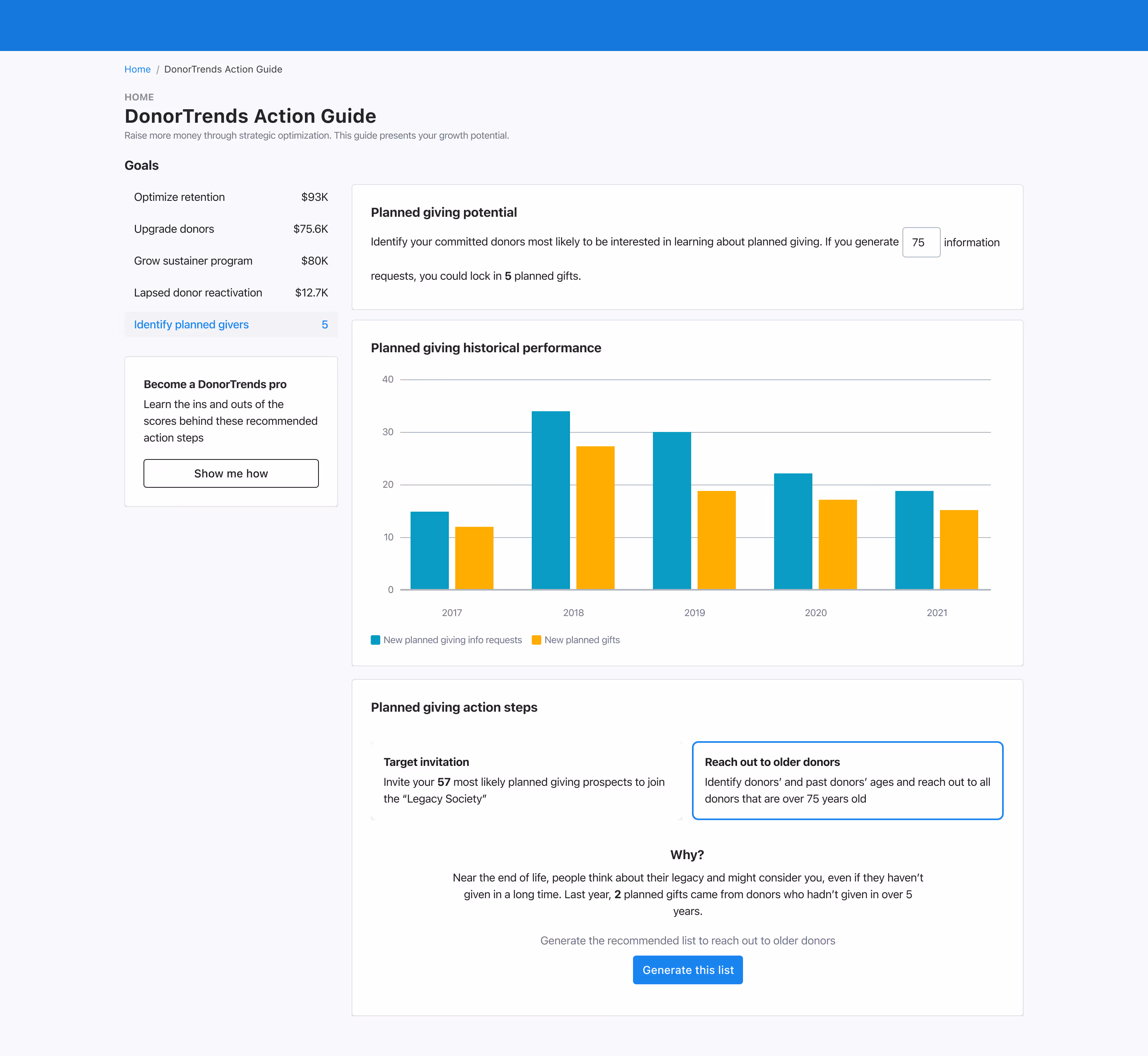
Eventually we found our sweet spot - one streamlined page with each strategy broken into three clear sections: Potential, Historical Performance, and Action Steps. The complexity was gone, the structure was consistent, and we were ready to see if it actually made sense to fundraisers.
We tested with fundraisers from seven organizations. Users immediately understood the strategic value but struggled with some of our jargon and wanted clearer guidance on next steps. These insights helped us tighten the language and strengthen the recommendations.
We tested with fundraisers from seven organizations. Users immediately understood the strategic value but struggled with some of our jargon and wanted clearer guidance on next steps. These insights helped us tighten the language and strengthen the recommendations.
Client feedback
Representative quotes from usability testing sessions highlighting both excitement and practical concerns.
I would pay for the recommendations section. These are the first things out of the box we could do, so that's exciting.
What jumped out is you gave me 15 people to target for sustainer conversion - this is doable - and told me exactly what we need to do. The percentage is right there. All of this makes me really excited.
What if I've already done this action? Is there a way to check it off? In 5 years, if I've already implemented this, I assume the system would still be giving me the same suggestions.
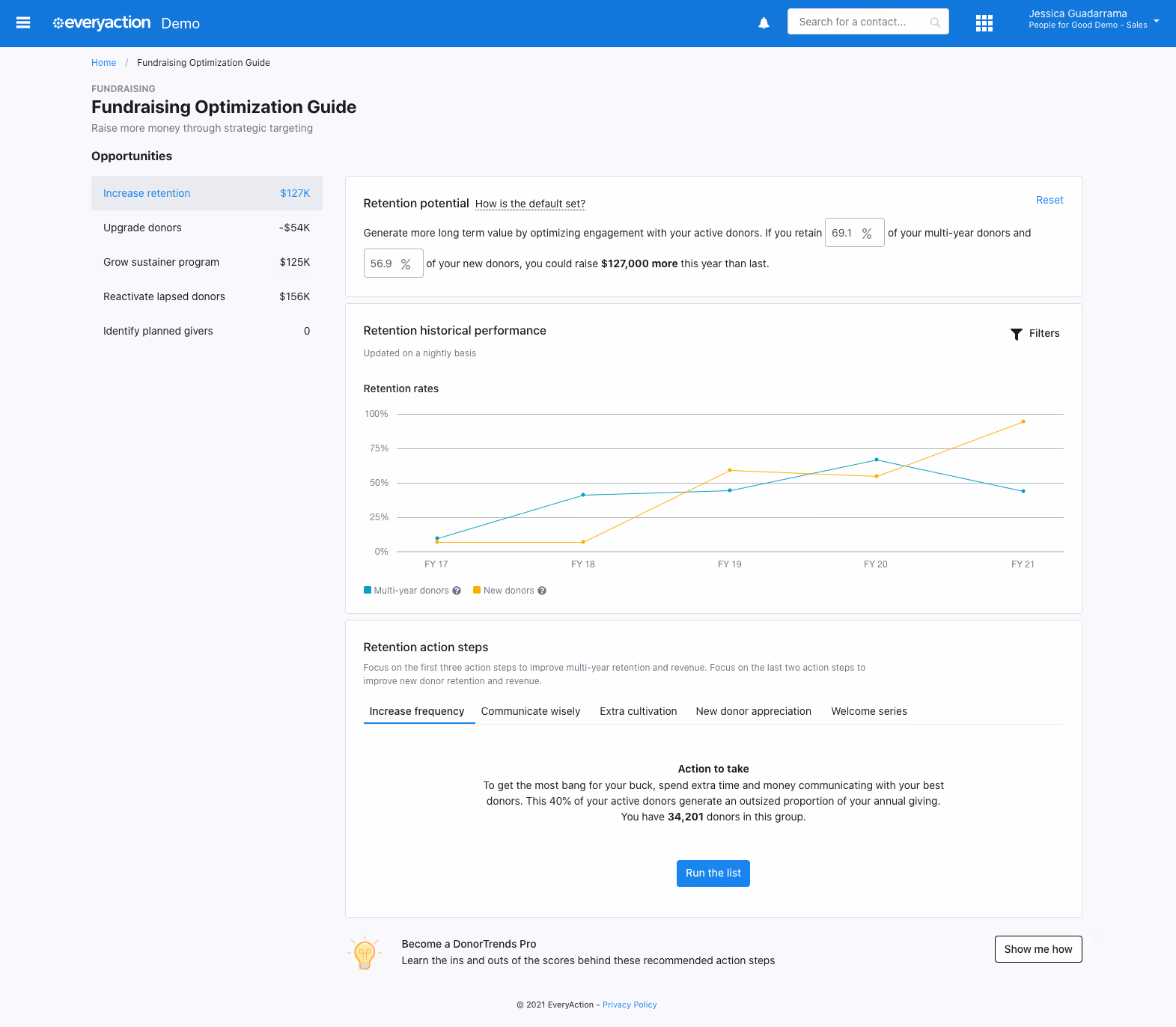
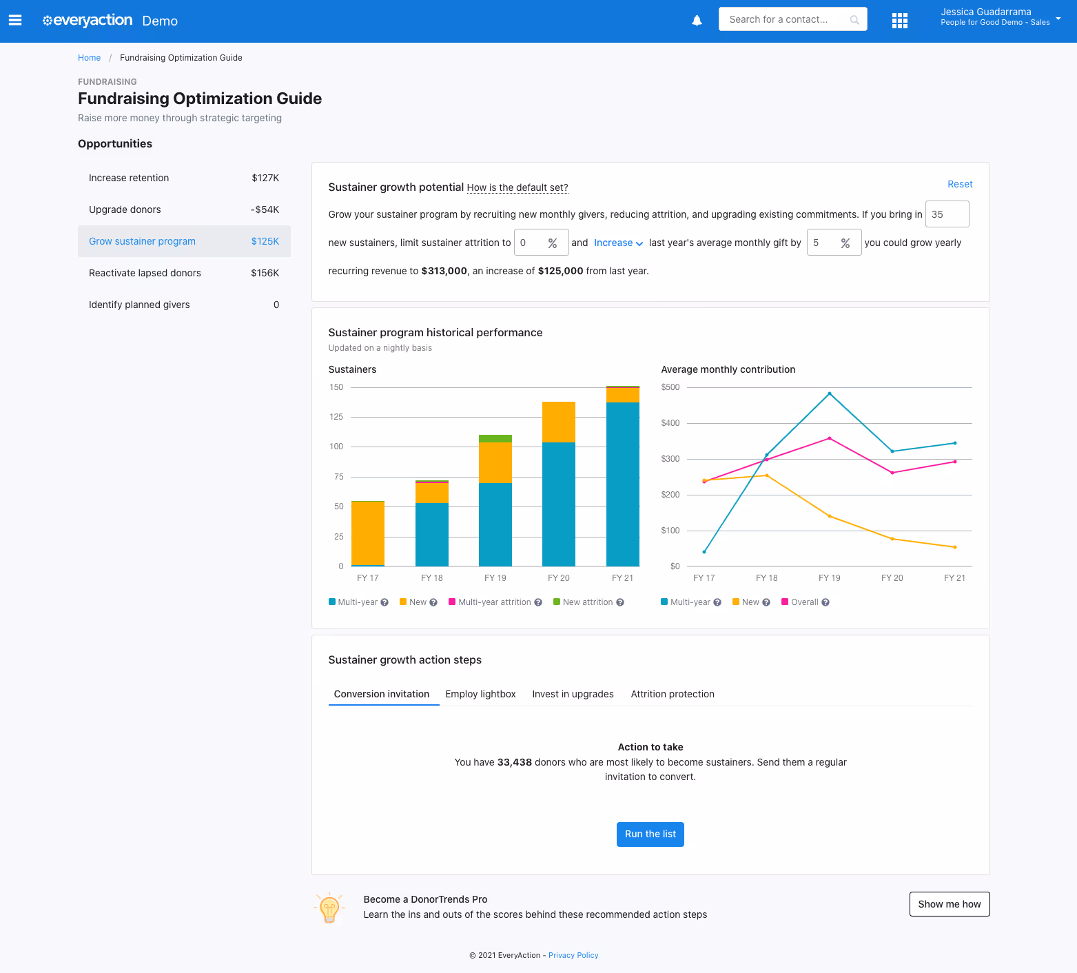
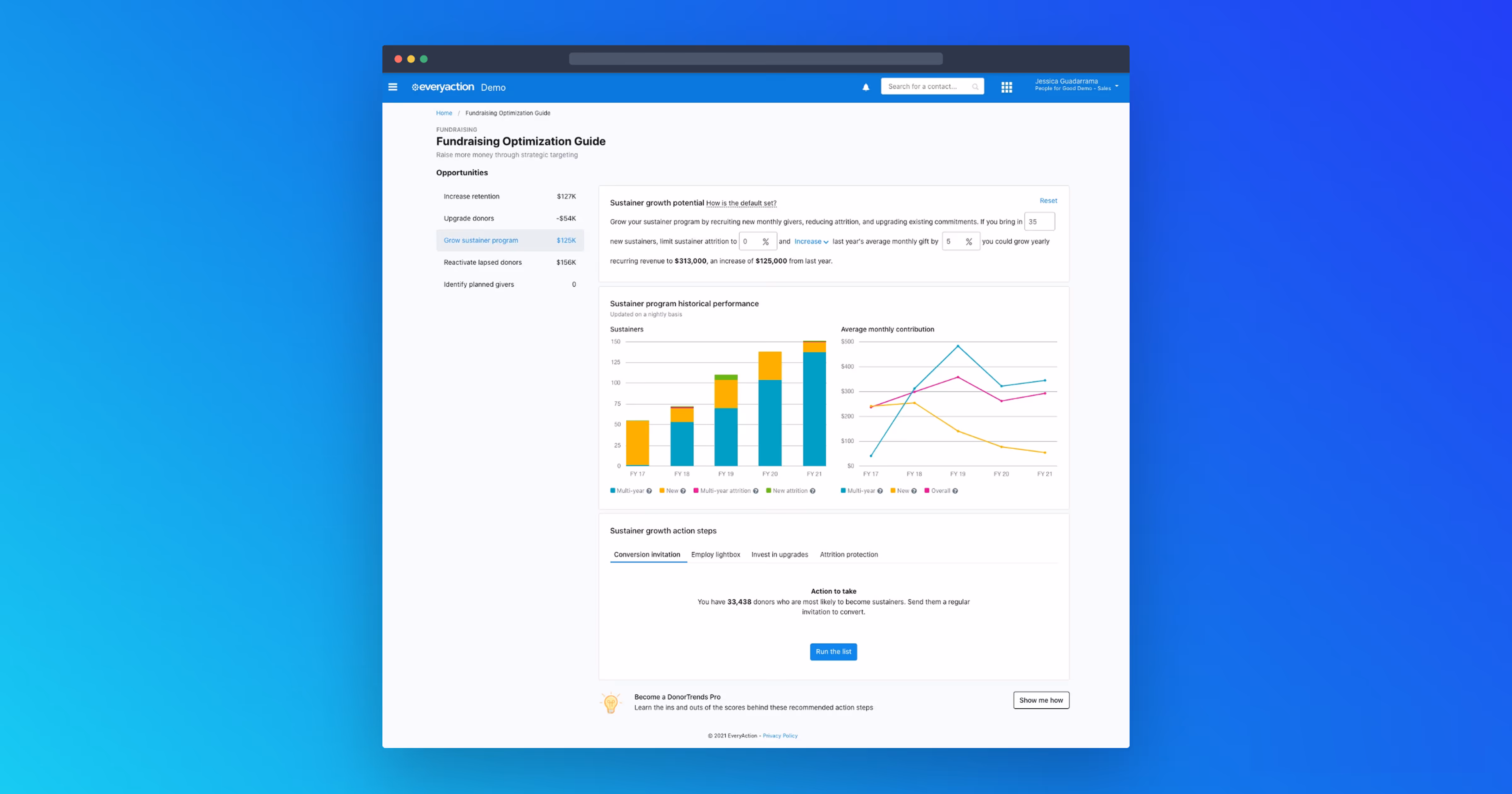
The Result: Fundraising Optimization Guide
After testing and refining, here's what we landed on: clean calculations, clear recommendations, and those high-dollar insights surfaced exactly where fundraisers needed them.
Interactive demos let DonorTrends prospects explore real ROI calculations themselves, leading to prepared sales calls using their actual NGP VAN data.
Users could explore the interactive guide immediately with automatic nightly data updates, focusing on taking recommended actions instead of manual file management.
The outcome: We wove predictive intelligence seamlessly into fundraisers' daily workflow, with no separate logins or context switching—just smart insights right where the work happens.